

In the digital age, music streaming services like Spotify, Apple Music, and SoundCloud have become prominent and relied on in the music industry; they orchestrate not just what we listen to, but how we interact with music. At the core of this influence is an often-overlooked tool: infographics. While often subconsciously, infographics are powerful visual representations of data that do more than just decorate; they drive decisions, shape trends, and even promote new talent.
In honor of infographic week for my class, today’s blog will be dedicated to uncovering how these graphical insights tune user behavior and amplify strategic communication in music streaming platforms.
Steering Listeners with Visual Cues
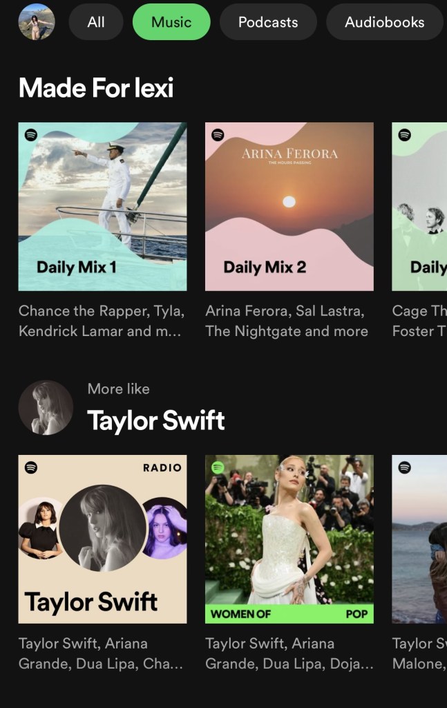
The first and most direct way music streaming services use infographics to connect with their audience is through personalized dashboards that reflect listening habits. As a Spotify user, let’s use this platform as an example. These dashboards are filled with colorful and engaging graphics showing the most-listened genres, artists, new playlists, and even suggested artists you may like based on the music you listen to. Each graphic has a captivating image of artists or related themes based on the genre. This not only enhances user engagement by providing a customized experience but also subtly encourages more platform interaction. The more you see your musical identity laid out in an appealing format, the more likely you are to explore new playlists and songs.

Highlighting Trends & New Artists
Another strategic use of infographics is in the promotion of emerging artists. Platforms like Spotify’s “Discover Weekly” and Apple Music’s “New Artist Spotlight” use complex algorithms to predict what new songs might pique your interest, presenting these recommendations in a visually appealing format.


These platforms not only introduce fresh talent but do so in a way that feels personally tailored to each listener. People are more likely to be drawn to a visually appealing image than to a title or word. This brings us to…
Infographics as Strategic Communication Tools
The strategic communication aspect of infographics in music streaming services is genius. By converting complex data sets about listening trends and user behavior into comprehensible and attractive visuals, these platforms do more than report information—they tell a story. This narrative isn’t just for users but also pitched to artists, record labels, and advertisers to showcase the platform’s role in shaping music consumption and culture.

An Example
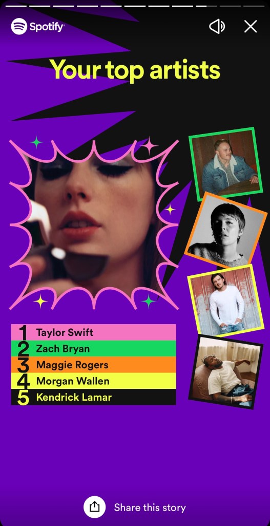
These visual stories help articulate the platform’s impact on music trends and artist popularity in a visually appealing, understandable and interesting way. You may be familiar with or heard people talk about their “Spotify Wrapped,” each December since 2016. Spotify Wrapped provides a unique way to look back at the music that defined your year, highlighting your top 5 most listened-to artists, songs, and even the exact number of minutes spent listening to music. The information is presented in brightly colored graphics in an interactive way, with new statistics thought of each year. It is a genius marketing strategy to draw users in and incentivize listening to music.

Click here to learn a little more!
The Impact on the Industry & its Future
The logistics of music streaming services using infographics extend beyond individual user experience. These visuals help change music consumption by highlighting smaller artists alongside mainstream names that may have similar styles or backgrounds. It is also a goldmine of data for analysts and industry professionals to accurately track shifts in music popularity and emerging genres. As we continue to uncover the field of digital music, these visual cues have and will continue to play a pivotal role in guiding our music journeys.
With this information, I encourage you to check out the music streaming service you use most. I’m guessing you’ll look at it from a different perspective and notice how much those visuals impact your new music selections!
**Images from Pexels & Personal Spotify**

Leave a comment